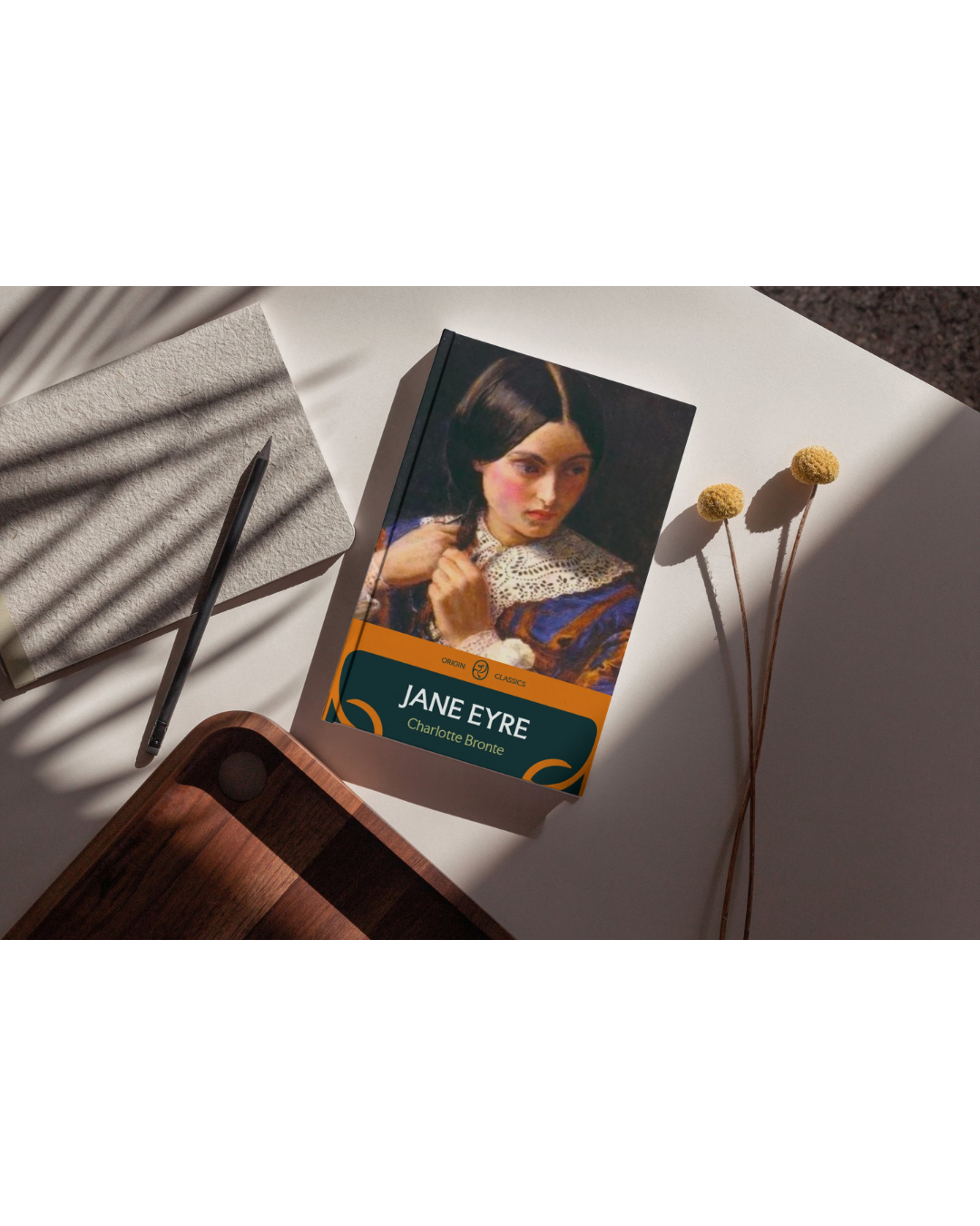
Origin is a fictional publishing company created in April 2026. It was presented as a branding project for Design Fundamentals, with the guidelines to follow the name Origin and the given area of branding, which I received as publishing. This company acts as one of the five major publishing houses, providing branding and marketing that pay homage to the extensive history of most of the largest publishing houses, dating back to the 1800s.
Brand Mission
Origin publishing aims to bridge literary heritage with contemporary storytelling by publishing works that shape conversations across generations and global audiences.
Target Audience
Origins publishing targets culturally engages readers who value thoughtful storytelling and intellectual curiosities. From university students to creative professionals, Origin provides literature for all ages and interests
Brand Positioning
The identity system uses a restrained color pallet, archival inspired layouts, and tactile application to reinforce the company’s commitment to timeless publishing traditions.
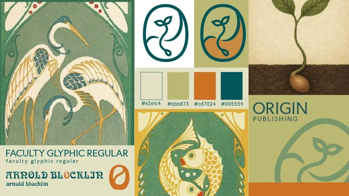
The branding for Origin Publishing draws inspiration from Art Nouveau typography and the idea of creative and intellectual growth. Influenced by the Art Nouveau typeface Arnold Böcklin, the logo’s organic curves reference the form of its capital “O.” The sprout symbol represents the origin of ideas and storytelling, while the earthy color palette and refined typography evoke growth, learning, and the timeless nature of publishing.
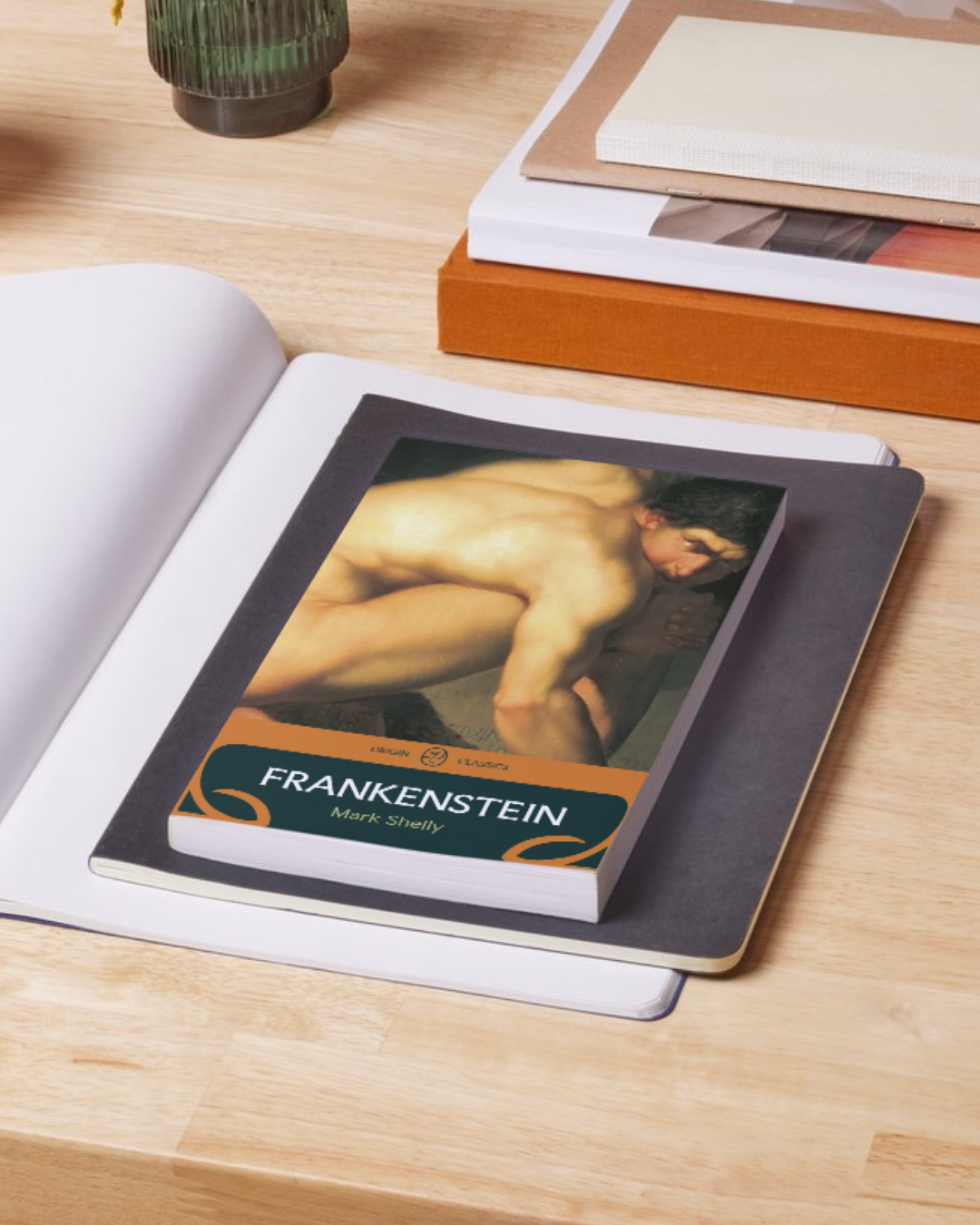



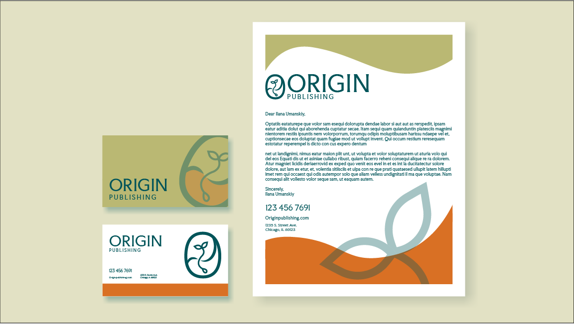
For this project, I developed a visual identity for a fictional historic publishing house, modernizing its brand while preserving its literary heritage. The goal was to create a scalable brand system that could be applied consistently across print, digital, and social media touchpoints. By establishing a cohesive and recognizable visual language, the branding positions Origin Publishing for continued global growth and future marketing initiatives while maintaining the credibility and prestige of a legacy publisher.